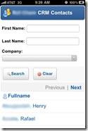
The first thing you need to do to make your Xpage application look like a native iPhone app is to put all the parts(view, form, etc.) into 1 Xpage. I did this with two panels, one is hidden while the other is showing. In the first panel, which is set to display:none by default, is the contact form. The other panel which is visible by default is the view and search function.
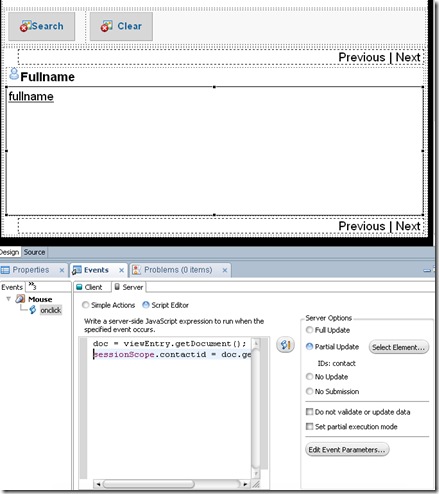
Configure the links in the view to set the document(data source for the contact panel) to the universal docid by using the columns onClick event on the events tab. Set it to partial update the contact panel to receive the information from the document data source. On the client side js in the onClick event, set the panel with the search view in it to display:none, then set the contact panel to display:block.
Then create a back button on the contact form that hides the contact panel, and displays the search view panel.
The reason you need to put everything on one page and use Ajax refresh is because of the next step, also it is much much faster then changing pages. Add this meta tag to the Xpage.
<meta name="apple-mobile-web-app-capable" content="yes" />
When a user bookmarks a your web page with this meta tag on the iPhone home screen, it will open in its own safari app process, it will not show the location bar or the bottom nav bar. If you click on a link to another web page it will open it in a normal Safari window and take you away from the app, ruining your appearance of it being a native app.
Another meta tag that really makes a difference is:
<meta name="apple-mobile-web-app-status-bar-style" content="black" />
This will set the top bar with “ATT and time” to be black when the app is opened.
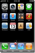
Now we want a custom icon on the iPhone home page, and a startup image too. For this we add two links:
<link rel="apple-touch-icon" href=”/icon.png” />
<link rel="apple-touch-startup-image" href="/startup.png" />
Notice the CRM app icon on the desktop, then look at the startup “splash screen” image.
The start up image comes up immediately, then waits for your page to open. I suggest making your own Domcfg.nsf login form using the ultralite login subform as a start, then make the buttons and fields allot bigger. i also found out that sometimes this replaces the iPhone home icon with the ultralight login image, so fix that as well, every app will have to have a custom login form. I also added the ability to remember the password, not just the username. You can search the web to find the correct dimensions for these pictures.
All that is left is to put in some nice webkit transitions when you hide and then display the panels. I like to first fade out the current panel, after the fade out has occurred - set it to display:none, Set the next panel to display:block, then fade that panel in. Most of this can be done with CSS, i will blog on this later. You can also do the card flip or any webkit transition you would like.


2 comments:
Wow, really nice. Thanks for sharing. Any plans to take the next step and do data capture from iPhone? I remember trying a while back without xpages and got buried trying to do something as simple as date/time pickers.
Carlos
I plan on starting to work on todo's and the journal. Neither have a real counterpart on the iPhone, so i thought they would be good things to have.
Post a Comment